Table Of Content
What is the Difference Between Responsive and Adaptive Design? Let’s Explore Below
The web design industry is a fluid field that is constantly changing and evolving, improving for the better. Just a decade and a half ago, websites tended to be rather text-heavy. However, as the use of graphics became more popular, websites adapted and went a little visual-crazy in the mid to late 2000s. But whatever the prominent design trend of the time, the fact remained that designers did not have to worry about adapting their website pages for different screen sizes.
Soon however, mobile devices and smartphones were introduced that could access the internet on the go using cellular connections. Now a new problem arose. These devices, such as smartphones and tablets all had different screen sizes. That required developers to come up with ways to improve the viewing experience for their consumers, regardless of their viewing medium.
Since then, the debate of Responsive vs. Adaptive design has been raging, with both sides offering compelling arguments. If you too are confused on what to choose for your project, read on.
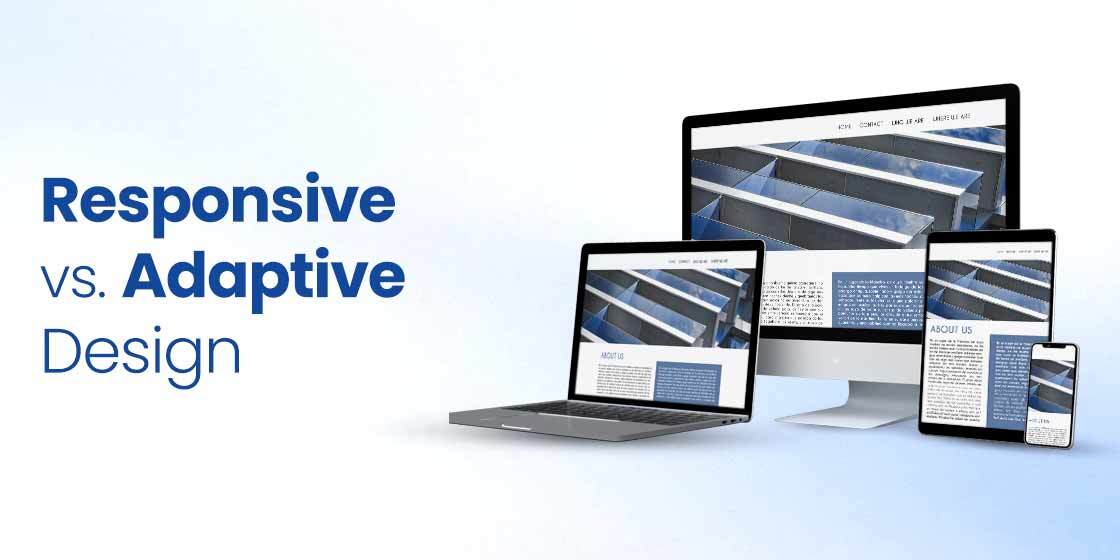
Responsive Website Design for Different Devices
Nowadays, no matter web development services you hire to create your website, makes their web pages compatible with a lot of different screen sizes, from PC and mobile phones, to tablets. But it isn’t just done to make the page design compatible with different screen sizes.
Today, these web pages are designed with the capabilities and functionalities of the devices in question, meaning that depending on how you access the site, your web page may offer different features. For example, a website viewed on a PC often requires us to go to settings to change the zoom. However, on a mobile screen, all it takes is the two finger pinch to zoom in or out.
From the native functionality of the device, to the usage environment of the user, all of these factors and simple UX design basics combined can be used to create a web page that offers a good user experience.
Adaptive Website Design Factors That Improve Cross-Platform Design for Better UX
Different devices offer different functionalities that could be incorporated within your adaptive website design. But how are we to know what facets of technology to manipulate in order to create a good multi-platform design?
Listed below are some of the most critical factors we can use to make our responsive designs look good on different screen sizes, for a great user experience.
- Gestures
Unlike PCs, mobile devices like smartphones and tablets allow users to interact with your mobile-first responsive design in a different, more interactive way. From pinch-to-zoom to rotate and double tap, these interactions should be used when making your simple mobile-first adaptive design compatible for different screen sizes.
- Design Hierarchy
Mobile screens have a smaller visual size that can be used to show your content. As such, your fluid responsive design needs to adapt in a way that it doesn’t look like a text wall, boring the users and making them scroll repeatedly.
- Navigation
Navigation is something that needs to be uniform no matter the medium of viewing you use. Learning an entirely new navigation paradigm will only result in end-users having a bad user experience. And while creating a fluid adaptive design is a complex task, consistency will help you ensure that your users have a seamless experience moving from device to device when using your website.
What is Adaptive Design?
In the responsive vs. adaptive design debate, adaptive design is the less popular option when it comes down to it. However, despite its low popularity, it can help a lot of sites adapt to different screens without affecting your UX.
How it works is that there are multiple screen designs for each page. And depending on the type of device you access it from, the corresponding screen will be loaded. Usually, the six most common display widths for screens ranging from desktop to mobile are kept in mind when creating your page design, making it easier to adapt your design elements in a way that makes adapting it to different screens simpler.
While it usually creates a lot of work for the designer itself, adaptive design has the potential to be the best page design considering it is created for specific screen sizes. However, if you stick to the functional requirements of your page design, you will find that adaptive design is a good option for your website.
Adaptive Design Strategies
To create an eye-catching adaptive design, you need to work with some strategies. Without them, you can not create adaptive designs no matter what type of tools you use. If you do not know much about them, take a look at the points below to understand how to implement adaptive design in any website or mobile application.
- Adaptive design requires a perfect layout evaluation, so make sure to do that before starting to code anything for the user interface.
- It is best advised to pick the right tools and technologies for adaptive website design, preferably those that are recommended by the top experts.
- Adaptive design now plays an important role in search engine optimization. So, make sure to build adaptive design for SEO correctly, so that you can get quality results.
Adaptive Web Design Pros and Cons
Being a web designer, you should know about the advantages and disadvantages of adaptive web design. It helps you to make better decisions related to the usage of this design in different sections of a website. Let’s take a look at them in detail below.
What are the Benefits of Adaptive Design?
There are a number of benefits to using adaptive design over responsive design for your website. Some of the most common adaptive website design benefits include:
- Quicker load times
- Allows control of each element of your design, thus giving us the ability to create the best possible design for each screen size, whether we are going for a mobile-first design approach or a more hybrid approach.
Let’s say that a restaurant’s website uses adaptive design. and they know that a mobile user accessing their page may be in the action stage, and is more likely to be vetting the restaurant as a possible dining option.
On the other hand, a desktop user may still be in the awareness phase. As both of these require different focuses for their screens, you can use adaptive design to focus on different parts of the content when designing your enterprise mobile apps and PC layouts.
What are the Adaptive Design Disadvantages?
While there are many adaptive design advantages design for your simple websites, there are a few cons you need to be aware of in order to make an informed decision. They include:
- The design is extremely labor intensive
- Duplicate content on multiple screen mockups can affect your search ranking on search engines like Google.
What is Responsive Design?

A responsive site, as the name suggests, is designed to be responsive to changes in the changes, unlike adaptive design approach. Now it may seem that they are the same thing, there is a subtle difference, but one that can make all the difference in how you approach creating websites for multiple screen sizes.
Responsive web design is built using a flexi-grid, which makes it easy to align the elements on the grid no matter what type of device you are using. That allows your design to be constant, making for a better user experience. Think of it like this. A website arranges all its elements in a 12-column grid for a desktop screen, while it uses a 7-column grid for the tablet, and a single column arrangement for the mobile.
Despite the change in screen size, the elements are rearranged according to the grid, stacking over each other as the columns are reduced in a grid. You can visualize it as water taking on the shape of its container. Its volume remains the same, no matter what container we use. However, the shape of the water changes accordingly.
Responsive Web Design Strategies
Many beginners often remain confused while creating a responsive design. It usually happens because of their lacking strategy that exposes their inability to work on UI/UX. If you are also one of them who is looking to know how to implement responsive design, take a look at the points defined below.
- Responsive design requires a good skillset on top java frameworks, so make sure to first enhance your expertise on those web development platforms.
- A responsive design must look good on mobile screens, so always remember to design its layout keeping that in mind.
- Nowadays, creating a responsive design for SEO has also become very important. It is a good strategy to make your websites properly accessible on mobiles to get a greater chunk of traffic.
Responsive Web Design Pros and Cons
Responsive design is a great way to showcase the dynamic layout of your website. However, it has some disadvantages too. As a web designer, you need to know both about the advantages and disadvantages of responsive design, as it helps you to stay mindful of every outcome.
Let’s take a look at them below.
What are the Benefits of Responsive Design?
Responsive design offers a number of benefits to those who use it for their websites. These responsive design advantages include:
- Single page URL for all screen sizes
- The design process is less labor intensive
- Allows for consistency across different screen sizes
- SEO-friendly
- More poplar approach, meaning there is better support for it on the internet
What are Responsive Design Disadvantages?
No matter how popular and beneficial responsive design is, there are few disadvantages of responsive design for mobile devices we need to consider before choosing it for our projects.
- Longer load times compared to the adaptive approach
- Take longer to develop, despite the fact that they are quicker to design compared to adaptive. Adapting to different screen sizes based on a grid can take a long time to iron out the kinks
- The moving and stacking of elements may make it possible for images and other design elements to look weird or distorted.
Responsive Design vs Adaptive Design: Which is Better?

A user-first approach is extremely beneficial today whenever we are designing a website today. There are many bad website design examples where the design looks great on one type of screen, yet looks ridiculous when displayed on different screen sizes.
Therefore, designers need to consider a user, their habits, the kind of user experience they might be looking for, and more when designing your website. That means that you should know about the places where a user might focus and concentrate, and bring them to the forefront when adapting your web pages for different screens.
Moreover, there are other factors which can skew the responsive vs. adaptive design argument one way or the other, including the preferred mode of browsing for users who frequent your website. Similarly, factors like the time to develop, and mobile-first approaches can also affect your choice of preferred design methodology.
But if you do the required research and homework, you will be able to choose the design methodology that perfectly suits your website’s needs.
Conclusion
Responsive vs. adaptive design is a debate that can be of great benefit to you when designing your website. It can result in you thinking in great detail about your prospective users, and how they might interact with your website. That, in turn, will help you make the right choice, and one that will help you grow your business by giving its focus a direction.
There is a lot of effort and planning that goes into developing a good website design that works well across a range of devices. However, by aligning your brand goals, content strategy, and user needs into a single dimension, you will be able to create a great user experience that your users will love.
FAQs
| 1. What is the difference between responsive and adaptive design? To make it simple, if the website looks distinctly different on desktops and mobile, then they are using adaptive design. and if the size refits according to your screen size, then its responsive. |
| 2. How does responsive design affect SEO? According to latest search engine ranking algorithms, Google pays attention to those websites that are responsive. Hence, this brings a positive impact on their ranking, allowing them to get top positions on SERPs. |
| 3. What are the advantages and disadvantages of responsive design compared to adaptive design? Responsive design has many advantages and disadvantages compared to adaptive design. It is preferred more by the designers, as it provides greater accessibility on mobile devices. |
| 4. How does adaptive design improve user experience? Adaptive design is precisely created to improve user experience. Its layout helps users to understand and navigate through the website easily, which is what enhance their overall experience. |
| 5. How does adaptive design help optimize SEO? Adaptive design also helps to improve SEO rankings. It has been recommended in the latest search engine algorithms, hence web designers should always pay attention to it while creating a website. |
| 6. How does adaptive design handle different screen sizes? While creating an adaptive design, certain parameters are defined in the code to adjust every screen size. That is why it is advised to always hire experienced react native developers to create responsive web applications. |
| 7. What types of websites benefit from adaptive design? Nowadays, every type of website should have adaptive design. From ecommerce to portfolio websites, every platform should have adaptive design built using advanced web technologies. |
| 8. What are the common challenges associated with responsive design? As a web designer, you should know about different responsive vs adaptive design challenges while creating a website. It helps you to prepare for everything in advance. Some of the common challenges in this process includes complicated layout, overloaded UI styling and more others. |
| 9. How can adaptive design improve web page performance? Adaptive design can certainly improve the web page performance. It helps to do so by creating a web page that is easily scrollable and understandable for the users. It helps to improve the web page performance and allow users to easily navigate through the website. |
| 10. What are the key features of a responsive design? There are several features of a responsive website. However, some of the important one includes easy navigation, fast screen adjusting, cross-platform support and more others. |
Empower your digital initiatives with BariTechSol, a premier custom software development company. Our skilled team tailors cutting-edge solutions to your unique needs. Elevate your tech experience and stay ahead in the digital realm. Partner with BaritechSol and code the success of your next big idea.