Table Of Content
Examples of Poorly Designed Websites That Will Define the Do’s & Don’ts of Development
Web designing has come a long way since its inception. It has not only improved in graphical aspects but also in terms of how building a website has become more accessible. Today website building tools have made it very easy to create websites with the help of drag and drop tools. But, still they are not recommended fully to design a website because these tools lack in some areas which can lead to creating a poor UI design. If you will search precisely, you will find plenty of bad websites examples available on the web showcasing why these platforms are not a good choice for development.
Being a designer, you need to understand that website development — with or without code — does not always assure a good end product. That’s because web design is not only an art but also a science. It requires a blend of creativity, a sense of aesthetics, and UX design psychology.
Let’s take a look at why smart brands prefer to hire professional designers and web development services for their business websites, and what happens when they don’t.
What is a Poor Website Design?
A bad website is not simply a matter of what is aesthetically pleasing and what is not, as these debates are entirely subjective. However, for a website to be good, it has to exactly know about the elements that can offer a poor user experience.
How easy it is for the user to navigate through the website, how effectively the website attracts the user towards the important aspects of the website, such as the CTAs. Does the website have a cluttered layout or not? Are the typefaces, the fonts, consistent or not?
These are some of the questions that need to be considered in order to ensure a good website design. In this article, we’ll study different websites find out what UX design basics they are missing, thus failing in their attempt to build a good website.
Top 7 Examples of Bad Website Design
For someone who’s outsourcing a web design project for their business or for their own personal brand, their lack of expertise in web designing makes it difficult for them to differentiate between a good and a bad website. It’s really important to know how to hire web developers to avoid getting a bad web design. As a result, they can face lower website traffic or conversion rates and not realize that it’s because of the bad website design. Just because a website looks good, it doesn’t mean that it really is good.
Despite the changing design trends, a website must have these basic elements that are universally used to create a good website design.
- Easy Navigation
- Clear Message
- Good Color Scheme and Contrast
- Clean Layout
- Niche-based appropriate design
- Proper animation
- Font Consistency
By checking if the designer has appropriately implemented these essential elements into the website, its performance and effectiveness can be gauged.
Easy Navigation:
It’s crucial to ensure that a website’s navigation menu effectively serves its purpose, for an effective navigation menu is one of the most important factors of web designing. Here are some of the common poor website usability issues found with navigation design:
- Creating an poor navigation menu is the biggest mistake one could make. It’s essential for the navbar not to be hidden from the user. And it should have high legibility so that it effectively serves the purpose of helping visitors navigate through the various different sections and pages of the website.
- Keeping the navigation menu simplistic is the safest option for ensuring straightforward navigability, which means that your navigation menu should not have too many links in its primary section. Instead, it should let the user hover their cursor over an option to show up a flyout submenu with more links within that section.
- The navigation menu shouldn’t be designed only for large screens, nor should the website use floating navigation with heavy graphics. It’s important to consider that most website visitors are now mobile users.
- Some websites even make the mistake of sporting a poor navigation bar for each webpage, which can confuse the website visitors rather than help them navigate easily. Make sure the navbar is consistent throughout the website.
- Use of long text labels complicates the different submenus rather than giving clarity which requires only one to two words.
Clear Message
It’s common practice for websites to use a hero section to avoid awkward content placement. As the first interaction between users and websites, it’s very important to leave a good impression on the visitor to ensure that they stay on the website for longer and convert into returning customers/visitors. Thus, it’s important for a website’s hero section to have a clear message regarding its product or service and/or its unique selling point. As to ensure that the website visitors form a positive opinion about your business, your hero section must not have these design problems:
- Creating a Generic hero section is a formidable mistake in web designing. No one takes a business seriously if its website is made in poor taste with a non-professional design. The hero section should be catchy and innovative, with a clear message from your brand and a responsive design.
- The hero section is the first thing visitors see on your website, but that does not mean one should squeeze everything into this section, from images, CTA, animation, content, and many other design elements; designers have to be careful not to clutter this area. Otherwise, adding maximum information here would be counterproductive.
- The CTA on a hero image must sport a befitting button on the banner along with the brand’s tagline. If the CTA is confusing or lost among the clutter, you miss the chance of making another customer. So it’s important to make your CTAs accessible, strategically placed, and attractive.
- Stock images or misleading content on your hero section indicates a lack of professionalism. So, it’s very important for businesses to avoid such a mistake. No matter how good the other sections of the website are. If the hero section is misleading or unprofessional, all the hard work in other areas also goes in vain.
- While choosing content for the hero section, it’s important to ensure that the files are not too large in size because they can affect the performance of the website. Even if you do a great job at designing the hero section, if it compromises the performance of your website, it’s of no use.
- All elements in your hero section should be carefully designed to ensure that it effectively engages and surprises visitors. To make this possible, one has to invest a sufficient amount of time and energy into researching and planning your idea to successfully materialize it. When you are deciding on the various design elements and not paying attention to the latest trends and futuristic concepts, your design can start looking outdated very quickly.
Contrast & Color Scheme for Creating Hierarchy
A good website always uses the help of contrasts to create a visual hierarchy for the arrangement of website content. This visual hierarchy makes the different sections of the website pop out. The contrast also helps make the texts more legible. This aspect is one that often has a say on the web development technology used too, with proponents of both sides of the PHP vs. JavaScript debate staying true to their preferred web dev technology.
This is why CTA’s are usually placed with a contrasting color. To ensure a good website design, make sure it does not have these issues:
- Weak or poor contrasts make things blurry to the eyes, the text becomes illegible, requiring you to squint, and the overall website looks very bland and non-professional. Using a color scheme with complementary and contrasting colors can prevent such issues.
- The use of loud colors for a website built for business professionals would instantly make them switch tabs. So, it’s important to use a color scheme that is relevant to your audience’s taste.
- Using too many colors can make your website look bad. What’s ideal is to use your brand’s color scheme. This way, your website would look professional and aligned with your brand identity.
- Web designing without using the colors from amongst the 216 web-safe colors is considered alright, as many people believe that the best practice of using these colors is now outdated. However, the use of web-safe colors is crucial to ensure that each user experiences similar colors on their browser.
Clean Layout
In an attempt to create an amazing website, sometimes novice designers make the mistake of going over the top with the design, which does nothing but makes the website look cluttered with content. A clean layout does not necessarily mean a minimalist design; however, keeping a balance between a content-rich website and a minimalist website is crucial for creating a good website.
The most important thing needed for creating a good website is not only to have an aesthetic sense but also a sense of how a user browses a website. Make sure to follow these guidelines for ensuring a clean website layout:
- Navigation menus are supposed to be on the top of the page to ensure ease of navigation. Cluttering the layout with content would make it difficult for website visitors to find the hamburger menu.
- Proper use of content and white space is highly crucial for maintaining a clean look. For each section to pop up, your website not only needs to have contrasting colors but also a well-arranged layout with each section strategically placed across the landing/web page.
- An effective layout helps maintain harmony across the web pages; otherwise, each page would look different.
- The website layout should be responsive and compatible across different platforms, and in order to ensure this, it’s important to test the website across different platforms for the fluidity of the layout. When the elements of a website do not adapt to the smaller screen, they are prone to overlapping or becoming too small to read.
Proper Animation:
In order to create an interactive website, designers can make the mistake of compromising on multiple major factors. Thus, it’s important to weigh in on the pros and cons of an interactive design. One of the most common ways web developers implement it, is by using one of the popular front-end development frameworks or libraries available today. They can choose between Vue vs. React, Angular, or others based on what they plan to create.
- Web designers can make the mistake of choosing a kind of animation that may look good but can be counterproductive if not used properly, i.e., if your website heavily depends on traffic coming through SEO efforts, using parallax scrolling is not advisable.
- Animations should not be used to make a website look cool; rather, they should be done to improve the user experience, i.e., when horizontal scrolling is applied to an image-based list of movies, books, or songs, it can enhance UX. But when it’s applied to the entire webpage, it feels odd to users and is often unappreciated.
- Heavy animation can result in slower page loading speeds. Therefore, it’s often better not to use them on a page that already has a lot of information to render.
- It’s important to consider that animations may not run properly on a particular browser or on a mobile device. For instance, parallax browsing may not work properly on mobile devices unless it’s properly translated to work on them. If that can’t be done, and if the majority of your website visitors use mobile devices, it’s best to look for an alternative that would work best on mobile.
Font Consistency:
An understanding of typefaces and their proper usage matters a lot when designing a website. Therefore, designers need to pay utmost attention to ensure the right usage of fonts and typefaces.
- When it comes to branding, fonts are just as important as vocabulary. That’s because fonts have a rich character that speaks to the audience.
- Fonts that originate from the same typeface are ideal for ensuring consistency in font usage. However, using fonts of different typefaces that complement one another could also provide fruitful results.
- Also, in the case of working on a modern website design, the fonts should also be modern. This helps maintain balance in design. Using comic sans can work for a marvel’s website, but it would be in stark contrast to a minimalist and sophisticated design.
- Consistently maintaining font hierarchy provides the readers with visual cues for improving the readability of web content.
- It’s also important to note that font hierarchy is also part of font consistency, as body texts across the different sections of the page are consistently similar yet consistently contrasting with the title fonts.
Niche-based Appropriate Design:
Each category of the website has its own standards and conventions of design and development. It’s important to ensure that you follow these design conventions so that your website serves the visitors properly.
- It’s always a good idea to brainstorm market and broad niche ideas. Your web design plays an important role in meeting your marketing goals, which could either be to make more sales or to have more subscriptions.
- In the case of a niche-based website design, it’s important for developers to focus on designing the website according to a niche’s core features. These vastly vary when building a website design for a specific niche; for example, one of the core features of an eCommerce website is its secure payment gateway, whereas, for a government website, its core features should be focused on high security, accessibility of online forms, and a minimalist, easy-to-navigate design.
- Niche-based websites often have the same feel to them, so while it could be beneficial to stand out amongst your competitors, your design should not be a far stretch from what a visitor would expect of it.
- Some niches often demand a major update to a website; for instance, if you’re starting your business catering to a single category of product and in a year or two may wish to add more categories, it’s important to ensure that your website can easily adapt to that change. It also requires that you develop your websites using the best web programming languages designed for scalability.
Real-World Examples of Unprofessional Website Design
In order to learn what looks like a poor user interface layout, you need to look at the worst website design examples given below. These sites look very generic, offering no visual quality or creativity whatsoever. Here are some of the examples of ineffective website layout defined below.
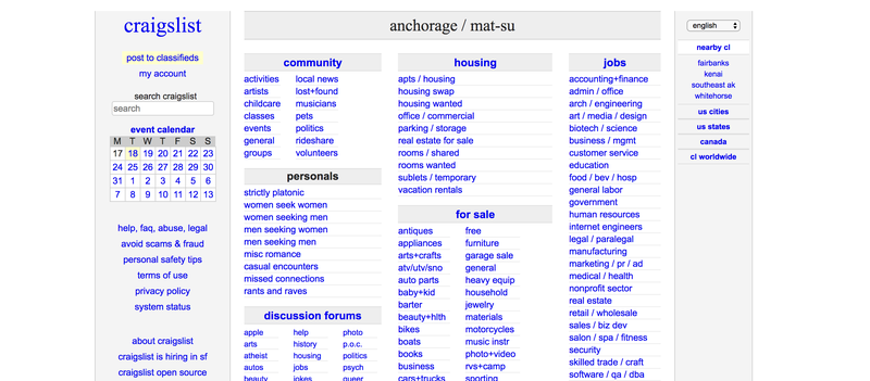
Craigslist:
In terms of its UI, Craigslist makes it to the top of our cringe list of web designs. The website seems to have taken its name too seriously because there’s nothing graphical on the website except for bare-bone lists of classified ads. One might say that there’s nothing wrong with the website, but if so, that is just because the website literally has nothing except for… well, lists!.
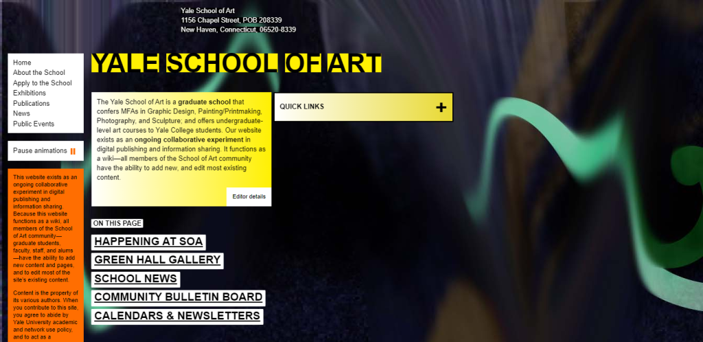
Yale School of Art:
Yale School of Art‘s website seems to be an avant-garde attempt at creating an artistically unique website, albeit the attempt went horribly wrong! It’s nothing short of a disaster. For a very basic-looking website, the page animation makes the bare-boned website embarrassingly slow. Neither the website has any proper structure and layout, nor there’s any harmony in its color scheme. Their website honestly looks like a school boy’s project made for a Web Design Summer Camp.
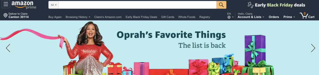
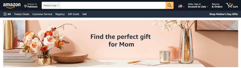
For an international conglomerate that’s among one of the top 5 companies in the world, its website is quite underwhelming. And while one might argue that it has, at the most, a sub-par web design, considering how big of a business Amazon is, I’d still call the website “bad.” That’s because being an eCommerce website, it has one of the most crammed-up navigation bars that I’ve ever seen on a mainstream website. Amazon would concur because the new version of the website does not have the same navigation bar anymore and looks slightly better now; still, it makes a good example for our case study of bad website designs.
Before:
After:
Best Examples of Unattractive Website Design
Being a beginner, you can do plenty of mistakes while designing a website. It generally happens due to lack of experience and market research. So, try to avoid that by looking at different examples of poor user interface design as that will let you know which things should be avoided to make a website UI look attractive to users. Let’s take a look at them below.
MIT’s CAVS Special Collection Website
Okay, so by now, I suppose it is clear that arts and visual studies institutes like to take an avant-garde approach towards their web designs; however, it clearly seems that often this attempt backfires. MIT’s Center for Advanced Visual Studies has an online repository featuring a special collection of works. The collection surely looks special, but the design, not so much. The scrolling animations distract rather than engage the visitors.

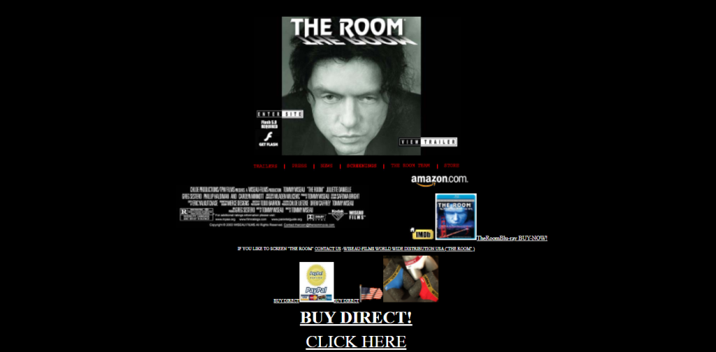
The Room Movie Website
Another website that has made it to our hall of shame is for the film “the room.” The website is outdated, with a very 1990s look and feel. The colors are garish and clash with each other, and the overall design is just chaotic. It’s hard to navigate, and it’s unclear what the website is trying to achieve. In short, it’s a mess.
Frequently Asked Questions (FAQs)
| 1. What is a bad web page design? A bad website is one that fails to focus on the user experience. That might imply it’s cluttered, difficult to navigate, has accessibility concerns, or any combination of the above. |
| 2. What makes a good and bad website design? The primary distinction between a good and a bad website design is aesthetic attractiveness, consistency, and the ability to assist businesses in achieving their business objectives. A good website has a clear structure, easy-to-use navigation, and a non-distracting design, whereas a bad website confuses or even irritates you. |
| 3. What are the most common mistakes made when designing a website? Generally, people pick flashy colors and styles for a web page design. This is one of the most common mistakes you will repeatedly see in different types of websites. |
| 4. What are the key elements of a website design that should be taken into consideration? There are different key elements of the design that should be considered while creating a website. It includes proper selection of colors, typography, content placement and few more others. |
| 5. What are the biggest challenges associated with website design? The biggest challenge associated with website design is the selection of theme. Many web designers often remain confused while selecting it which is why it is advised to always do the research before implementing any theme or template. |
| 6. What are some of the worst website design examples? If you want to know about the do’s and don’ts of website designing, take a look at various examples of poor website design available on the web. Namely, you can take a look at the poor website design of Yale School of Arts, Craigslist and few more others to build a strictly don’ts checklist. |
| 7. What are the best practices for website design? While designing a website, you should consider some important rules to get a quality product at the end. It includes proper market research, right content placement, interactive UI design and few more others. |
| 8. What are the benefits of a good website design? A good website design always helps to appeal customers. It is the first thing that comes into their notice, hence it should be created perfectly using the right theme and colors. |
| 9. How can website design affect user engagement? An unattractive website layout can portray a very bad image of your company to the web visitors. It can directly affect the user engagement which will lead to lower traffic and conversions. |
| 10. What are the latest trends in website design? There are various design trends currently getting popular in the industry. It includes parallax scrolling, material design, voice responsive interfaces, dark mode design and more others. |
To Sum It Up:
Web designing is as much of a science as it is an art form. And having a lack of balance in either of these two can result in a bad website design. Thus, it is essential for web designers to not only have a good aesthetic sense, but also have the ability to create a great user experience.
Empower your digital initiatives with BariTechSol, a premier custom software development company. Our skilled team tailors cutting-edge solutions to your unique needs. Elevate your tech experience and stay ahead in the digital realm. Partner with BaritechSol and code the success of your next big idea.